
Artists’ Watercolor 101 Level III AECP

My new Altenew Artists’ Grade Watercolor 24 Pan Set arrived in the mail. A swatch chart normally is the best way to get to know a new set of water colors.
However, Kristina Werner demonstrated a technique she called Paper Pieced Faux Dip Dye in Day 8 of the Online Spring Card Camp 2. After watching her video twice I was totally intrigued and ready to open my new paints and create some Dip Dye myself.
Using five different color groups on water color paper I painted ombre stripes.
The bottom edge was torn to absorb more of the darkest colors including the dark gray in this set.
Once they were dry I cut strips of the different colors from 1/2″ to 1 1/4″.
They were then lined up and adhered to card fronts.


Water color paper that has gotten really wet (like the ones above) tend to warp. To make them nice and flat for cards I like to glue them to Fun Foam cut just slightly smaller than the water color piece. That is then adhered to a card base of extra heavy cardstock. If necessary the card can be put under a couple books overnight to keep it flat.
No-line Water Coloring

This technique is my greatest challenge. My first efforts were just hideous. Giving up was my best option until I saw Erum Tasneem’s no-line water color video. I watched it over and over and tried to copy her stroke for stroke. Of course, that’s no possible but it gave me the basic idea. I’m doing better and have several more of this image stamped and ready to paint again and again. The most important hint is make sure to leave light areas for highlights.
Erum inspired the way Statement Flowers are placed on this card. It was different than anything I’ve done recently. There’s lots of white space for a sentiment. Happy is ombre painted with Altenew Artists’ Water Colors. Gold Stickles are used at the center of the flower. The gold is repeated as a shadow to the sentiment, in the gold heat-embossing and gold splatters.
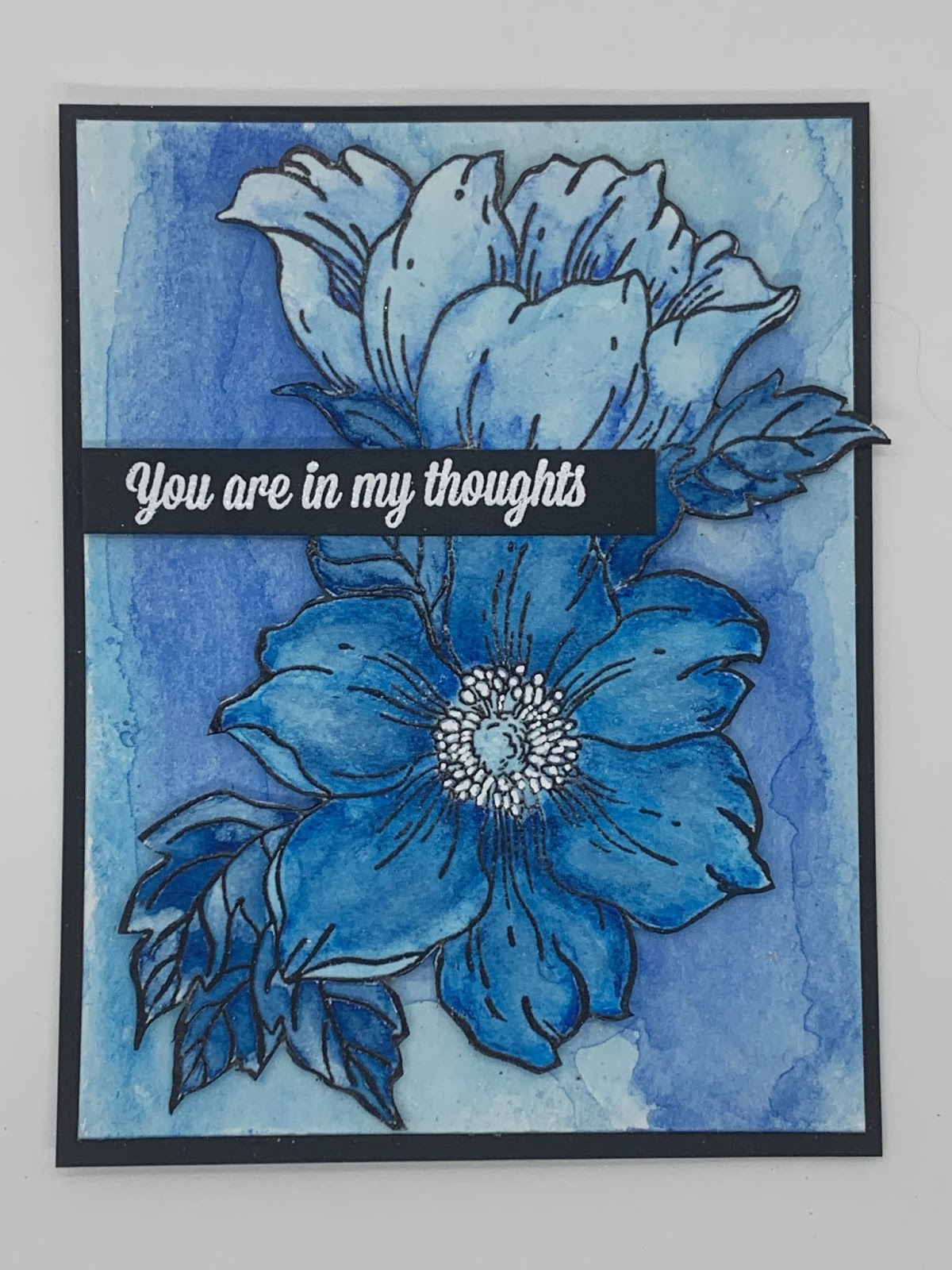
Painting a White Flower


This last card become more about the background than the white flowers.
I have had a long quest to design a monochromatic white card that met my expectations. That was the goal for this card. I can’t say I achieved it this time either.
Once the background stamp was chosen (Dot Botanicals) I tried white on white, good ole’ green leaves on white, silver on white and white on gray.
This was some complicated stamping that involved a lot of maneuvering on the Misti. I had several do-overs as I’d get confused and dip into white embossing powder when it should be silver. But I was determined and really anxious to see which background was best for these white flowers. My least favorite is the white heat-embossing on white cardstock … the all white I had been aiming for.
The other three are good looking cards that I could be happy with.