
Easy as ABC Level III AECP
showers or weddings. My nieces all get cards sets from me for wedding and baby showers.
I even include the postage stamps. It’s become a tradition they count on.
 Images from Ditsy Print were gold heat-embossed on 4 x 51/4″water color paper. Altenew water colors and metallic water colors were used to paint the images. Three letters were lined up, centered, taped with low tack tape and die cut using Caps Bold Alphabet Die. A 1/2″ frame was cut with a trimmer from the painted paper. It was adhered with foam tape to the 4 1/4 x 5 1/2″ Tim Holtz pattern paper. 1/8″ was cut from the interior rectangle. It was centered and adhered with glue.
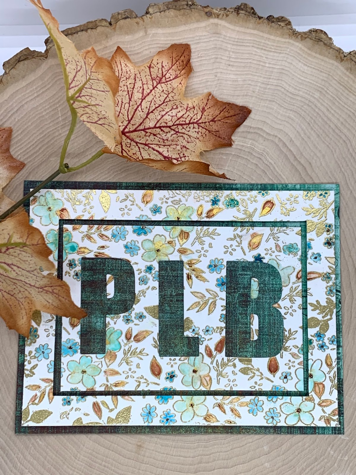
I used a toothpick to put tiny dots of Stickles in some of the flower centers for a little copper-color bling.
Do Over First Try

Those beautiful Initials from Caps Bold needed to go on a card. While trying to decide on design,
Jennifer McGuire just popped into my head. Her recent post had some great ideas I had been wanting to try.
I love to open my emails and find a video from Jennifer. We have virtual coffee together. I know I will want to purchase whatever she uses because she is just so good at using products in unique ways. And she explains everything so well.
However, she has the power of speeding up her video and die cutting off-screen. I’ve learned to multiply the time it takes her to make a card on video by at least 3 when I do it!
This card required 12-13 Fine Frame Diamonds to be cut from cardstock. All four sides of each diamond were scored with a stylus and scoring board. (I eliminated the scoring on the second card. It did not show up well. It also distorted the shape of the diamond when it came time to fit the tiny frame around it.) 12-13 more diamonds were cut from gold cardstock for the tiny edge.
Assembly was the challenge with this card. The first secret was to start with the center diamond.
and build from there. I had to experiment with the distance between each diamond. 1/4″ was too much. 1/8″ wasn’t enough. 3/8′ was just right. Once the diamonds were placed with equal distance between them, I placed the tiny diamond frame around each diamond. The secret here was to use a thicker cardstock that would keep it’s shape. A stronger background in geometry would be most advantageous.
Finally Floral Fantasy flowers in muted colors were adhered to the card. The colors allowed the Caps Bold Letters to take the stage.
This card took some time and reworking. It is rewarding to solve card construction issues and create a beautiful card I can be happy with. There will be no brothers or sisters for these cards. I will put one in my I DID IT box. When I hit a creative wall that box reminds me of just what I can do.

